

AVEVA Insight | Preview the New User Experience
Written by Fiona Straton, Senior Marketing Lead, AVEVA
Thanks for joining me for another edition of the AVEVA Insight blog! This month I am excited to be able to show you the preview of the new user experience (UX) now available within your AVEVA Insight system.
What’s new in AVEVA Insight | June 2021
- Introducing the new user experience
- What can you preview today?
- Enabling the new experience
- Compatibility
- Your feedback is important to us!
Introducing the new user experience
The new experience brings together the best of what you love about AVEVA Insight, and adds new capabilities, updated workflows and lightning fast performance. We’ve modernized the AVEVA Insight architecture so we can standardize and share components across all of Insight, allowing us to move faster as we add more and more capabilities over coming months. While it has always been fairly intuitive, this new design pattern will make things even easier. Based on your feedback, the new experience will:
- Improve workflows that you told us weren’t easy or intuitive to use
- Ensure consistency of the user interface across all components so that it is easier to adopt and use (even as we add more functionality)
- Increase performance and responsiveness
- Allow us to deliver more features and more capabilities more quickly
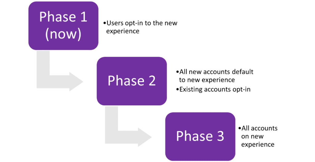
But, we get it… anything new can be overwhelming. That is why the new experience is currently available in “Preview” mode. And because use of the new user experience is set at the individual user level, you get to decide for yourself when to make the leap!
What can you preview today?
We prioritized development of the new experience based on what you told us was most important. That is why we have started with:
- Menus and navigation
- Search – we’ve better used the available space for search results and simplified the existing 3 panel search pattern. Stay tuned as we continue to expand the start we have made.
- Charts – line chart, column chart, status board, maps and graphics. We’ve added some new capabilities on individual charts, and added some new features such as pie charts, stacked results and more flexibility in data aggregation.
- New Dashboard workflow that simplifies creation and management of dashboards and the content displayed on them
- Newsfeed now directly links to associated assets for simplified drill down for analysis and fault resolution
Watch the video to the right by Darren Fraser, Product Director, AVEVA Insight to see the new experience in action.
Over the coming months, we will continue to add more capabilities into the new Insight experience. In time, this will become the default experience for new accounts, with existing users able to opt-in as needed. As we complete functional equivalence in the new experience, we expect that this will fully replace the existing Insight experience and unlock the value of a simpler user interface, improved workflows and a range of new features that we are working on within the new experience such as calculations and customization.
Enabling the new user experience
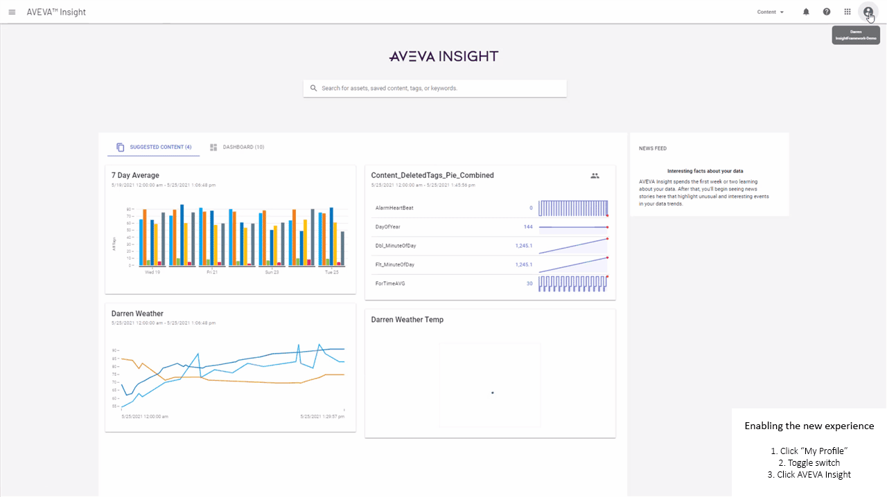
Enabling the new user experience is simple. Head to your User Account Details and toggle the switch to opt-in. And that’s it. And should you decide that there are key features still missing from the new experience, you can turn it off using the same switch just as easily.
As you navigate the new experience, you may notice some pages look like the existing interface. That’s because we have implemented cross-linking to all the existing pages for existing capabilities so that you will still have access to the full product experience.
Compatibility
The eagle-eyed among you may spot that some elements are yet to be implemented. This will happen over time however there are some areas to make note of, for instance:
- some chart features (e.g., limit lines, alarm overlays on charts) are still being implemented
- some chart types are not yet supported – we know that status board, line chart and column charts account for around 70% of all charts created in Insight, so we started with these chart types
- alerts cannot be created on a chart at this time. You can add an alert from any asset page, and within the next few weeks this will also be possible from the alerts list
- when using search, you can only select results to the group level and then add/remove additional tags from the data panel on the chart itself. We are working on refining search to add single and multi-selection of individual items at the moment
We’ve also worked hard to ensure compatibility between the existing Insight and new experience.
- For chart types not yet supported in the new experience, a status board will be used
- For chart types created in the new experience but not supported in Insight today e.g. pie chart, a status board will be displayed
- Existing dashboards can be displayed in the new experience
- Note: dashboards created in the new experience can NOT be viewed in the existing Insight UI as we have implemented new features to support inline content
Your feedback is important to us!
As we continue to build out the new experience, we would love to hear your feedback. What do you like, or not, about the new look and feel? Are there missing features that are show-stoppers for your adoption? Please send us your feedback so we know where to focus our efforts as we move on from this preview! Let us know by submitting an idea or question at https://new-insight-experience.ideas.aha.io/ideas/new and one of our team will get back to you. Note that this is specifically for feedback on the new experience for a limited time only, and any other issues should go through your normal technical support channels.
New to AVEVA Insight? Explore the live demo and sign up for a free 45-day trial using your own data and see how easy it is to transform your industrial operations.